
IELTS Academic Writing Task 1 Bar Graph
Useful Tips for Bar Graph
1. Understand
the chart: Check the X and Y axes, units (%, number), time periods, and
categories.
2. Group
similar data: Don't describe each bar individually—compare and contrast
instead.
3. Identify
trends: Look for highest/lowest values, similarities, and changes over
time.
4. Avoid
personal opinions: Just describe what you see.
5. Use
varied vocabulary and sentence structures.
6. Practice
comparing values using precise data (e.g., figures, percentages).
7. Use
linking devices to connect ideas.
Steps to Write the Report
Step
1: Understand the Question
- Read the
question and examine the bar chart carefully.
- Identify the
variables (categories, time period, measurements).
Step
2: Introduction
- Paraphrase
the question statement.
Step
3: Overview
- Summarize
key trends (e.g., highest/lowest, similar values, significant changes).
- Avoid
numbers here.
Step
4: Body Paragraphs
- Organize
information logically.
- Use data
(figures/percentages) to support your description.
- Compare and
contrast where appropriate.
Structure of IELTS Bar Graph Report
Paragraph 1: Introduction
→ Paraphrase the question.
Paragraph 2: Overview
→ Highlight the main trends (e.g., highest, lowest, changes,
similarities).
Paragraph 3: Body 1
→ Describe main data points with comparisons and figures.
Paragraph 4: Body 2
→ Describe remaining data points with comparisons and figures.
Useful Vocabulary for Bar Graphs
Introduction
- The bar
graph illustrates/shows/compares/presents...
- The given
chart provides information about...
- The bar
graph compares the number/percentage of...
Overview
- Overall, it
can be seen that...
- It is
noticeable that...
- A key trend
is that...
- The most
striking feature is...
Describing Data
- ...had the
highest number/percentage of...
- ...was the
lowest among...
- The figure
for X stood at 70%.
- There was
a significant/slight/gradual/steady increase in...
- The number
of X rose/dropped/remained stable...
Comparing and Contrasting
- X was twice
as high as Y.
- X was slightly
higher/lower than Y.
- The number
of A was comparable to B.
- In contrast
/ On the other hand / Whereas / While
Linking Phrases
- In
comparison / By contrast / Similarly
- In terms of
/ With regard to / Regarding
- Meanwhile /
At the same time
- As opposed
to / Compared to / Unlike
Example Overview Sentence
"Overall,
it is clear that product A consistently generated the highest sales, while
product C remained the least popular throughout the period."
Sample Bar Graph Question (for Practice)
The
bar chart shows the number of international students in three different
universities in Canada in 2010, 2015, and 2020. Summarize the information by
selecting and reporting the main features, and make comparisons where relevant.
You should mention two
things in your introduction
1. what
your graph shows
2. for what
period of time
Sample
1
|
You should spend
about 20 minutes on this task. The bar chart
shows the divorce rates in two European countries from 2011 to 2015. |

Introduction
The bar chart provides information about the
percentages of divorces in Finland and Sweden between 2011 and 2015.
For paraphrasing question I have used synonyms
as shown
shows → provides
information about
divorce rates → percentages of divorces
two European countries → Finland and Sweden (it’s good to be more
specific)
from 2011 to 2015 → between 2011 and 2015.
B. General
Overview
The second paragraph of your answer is a general overview, where you briefly describe major trends on your graph. Ideally, you should describe 2-4 key features.

Now it’s obvious that
·
Sweden experienced a
downward trend
·
Finland experienced an
upward trend
·
both countries showed
fluctuations
·
Initially Finland had a
lower rate, but in 2015 Finland outraced Sweden
Overall, Sweden experienced a downward trend, while Finland
showed an upward trend throughout the period. Both countries’ divorce rates had
some fluctuations. Although Finland initially had a lower rate, it outraced
Sweden at the end of the period.
C. Specific
details
After
we’ve written the introduction and general overview, it’s time to give the
specific details.
You can group data in such way:
1.
Details about Sweden (Body
paragraph 1)
2.
Details about
Finland ( Body paragraph 2)
Sample answer
The bar chart provides information about the percentages of
divorces in Finland and Sweden between 2011 and 2015.
Overall, Sweden
experienced a downward trend, while Finland showed an upward trend throughout
the period. Both countries’ divorce rates had some fluctuations. Although
Finland initially had a lower rate, it outraced Sweden at the end of the
period.
Sweden’s divorce
rate was about 45% in 2011, being higher than Finland’s rate by approximately
8%. Then, it rose to almost fifty percent in 2012. However, the figure showed a
gradual decrease to about 47% in 2013, and continued to decline steadily to the
end of the period, reaching around 45% in 2014 and hitting a low-point of about
37% in 2015.
Percentage of
divorces in Finland was less than 40% in 2011, and it decreased in 2012, when
about one third of marriages in Finland ended with a divorce (as opposed to almost
a half in Sweden). However, the figure experienced a steady growth during the
next two years. It rose to approximately 39% in 2013, then increased by around
3% in 2014, and remained steady for the next year, outracing the rate of
Sweden.
(192 words)
|
You should
spend about 20 minutes on this task. The chart below shows the total number of minutes (in billions)
of telephone calls in the UK, divided into three categories, from 1995-2002. Summarise
the information by selecting and reporting the main features, and make
comparisons where relevant.
|
Write
at least 150 words.
UK telephone calls, by category, 1995-2002

The bar chart outlines the duration of
local, national as well as international and mobile phone calls in the UK
between 1995 and 2002. Minutes are measured in billions.
Overall, British citizens talked over the
local land-lines the most and mobile phone gained a huge popularity over the
time.
It can be seen that between 1995 and 2002, the majority of
calls were made through local fixed-line connections. The number of minutes
rose from 70 billion in 1995 to just under 90 billion in 1998. After peaking at
90 billion in 1999, the figure declined steadily and returned to the 1995 level
of 70 billion minutes by 2002.
Moving to the national and international fixed line calls, in
1995, approximately 38 billion minutes spent but this trend was steadily went
up to 60 billion minutes in 2002. Even though, 2001 and 2002 had almost equal
numbers (60 billion).In addition, there was a dramatic increase in mobile calls,
just over 2 billion in 1995 to considerably under 50 minutes in 2002. This rise
was particularly noticeable from 1999 to 2002, during this time the usage of
mobile calls tripled.
(182 words)
Sample 3
You
should spend about 20 minutes on
this task.
The charts
below show what UK graduate and postgraduate students who did not go into
full-time work did after leaving college in 2008.
Summarise the information by selecting and reporting the main
features, and make comparisons where relevant.

The bar graphs display what UK graduate and postgraduate
students did after leaving university in 2008. Those who started working
full-time were excluded.
Overall, it can be seen from the graphs that a large number
of both graduates and post graduates went back to universities for further
studies. A good proportion of students took up part time jobs.
At
nearly 30,000, graduates who went on to study further greatly outnumbered their
counterparts in the other categories. Voluntary work, in comparison, was the
least common post-graduation step, with only 3,500 graduates going that route.
Those who worked part-time and those who were unemployed were very similar in
number, at 17,735 and 16,235 respectively.
Among postgraduate students, those who pursued further study
(2,725) and those who engaged in voluntary work (345) represented the largest
and smallest groups, respectively. However, significantly more postgraduate
students took part in part-time work (2,535) than were unemployed (1,625). (153words)
Sample
4
You
should spend about 20 minutes on this task.
The
chart shows components of GDP in the UK from 1992 to 2000.
Summarize
the information by selecting and reporting the main features and make
comparisons where relevant.
Write at least 150 words.

The
bar chart illustrates the gross domestic product generated from the IT and
Service Industry in the UK from 1992 to 2000. It is measured in
percentages.
Overall, it can be seen that both increased as
a percentage of GDP, but IT remained at a higher rate throughout this time.
At the beginning of the period, in 1992, the
Service Industry accounted for 4 per cent of GDP, whereas IT exceeded this, at
just over 6 per cent. Over the next four years, the levels became more similar,
with both components standing between 6 and just over 8 per cent. IT was still
higher overall, though it dropped slightly from 1994 to 1996.
However, over the following four years, the
patterns of the two components were noticeably different. The percentage of GDP
from IT increased quite sharply to 12 in 1998 and then nearly 15 in 2000, while
the Service Industry stayed nearly the same, increasing to only 8 per cent. At
the end of the period, the percentage of GDP from IT was almost twice that of
the Service Industry
(182 Words)
Sample 5
You should spend about 20 minutes on this
task.
The bar chart shows the monthly
spending in dollars of a family in the USA on three items in 2010.
Summarize the information by selecting and
reporting the main features and make comparisons where relevant.
Write at least 150 words.

The
bar chart depicts the monthly expenditure on food, gas and clothing of a family
living in the USA in 2010.
Overall,
it can be seen that levels of expenditure fluctuated over the period.
To
begin, in January the most money was spent on food, at approximately $500 per
month. Although expenditure on food increased slightly the following
month, it then fell to account for the lowest expenditure of all the items at
the end of the period at just over $300. Gas appeared to follow the opposite
pattern to food spending. It started lower at about $350 per month, falling in
the following month, and then increasing significantly to finish at just under
$600 in April.
Clothing,
which at just over $200 accounted for the lowest expenditure at the beginning
of the period, fluctuated dramatically over the time frame. After reaching
around the same levels as food in February (nearly $600), it dropped markedly
in March, then jumped to just under $700 in the final month. With the exception
of an increase in March, average spending decreased slightly over the four
months.
(183
words)
Sample
6
You
should spend about 20 minutes on this task.
The chart shows British Emigration to selected destinations
between 2004 and 2007.
Summarize
the information by selecting and reporting the main features and make
comparisons where relevant.
Write
at least 150 words.

The bar chart shows the number of British
people who emigrated to five destinations over the period 2004 to 2007.
It is evident from the chart that throughout
the period, the most popular place to move to was Australia.
Emigration to Australia stood at just over
40,000 people in 2004, which was approximately 6,000 higher than for Spain, and
twice as high as the other three countries. Apart from a jump to around 52,000
in 2006, it remained around this level throughout the period.
The next most popular country for Britons to
move to was Spain, though its popularity declined over the time frame to finish
at below 30,000 in 2007. Despite this, the figure was still higher than for the
remaining three countries. Approximately 20,000 people immigrated to New
Zealand each year, while the USA fluctuated between 20-25,000 people over the
period. Although the number of visitors to France spiked to nearly 35,000 in
2005, it was the country that was the least popular to emigrate to at the end
of the period, at just under 20,000 people.
Sample
7
You
should spend about 20 minutes on this task.
The bar chart
shows the participation of children
is selected leisure activities in Australia.
Summarize
the information by selecting and reporting the main features and make
comparisons where relevant.
Write
at least 150 words.

The graph indicates the level of participation
in various leisure activities between Australian boys and girls aged 5 to 14
years old. It shows what percentage of each group has enjoyed these activities,
and shows which activities are more popular by gender.
In general, the boys in this age group engage
in a higher number of included leisure activities than the girls, with higher
participation levels in all activities except art and craft.
As we can see, watching TV and videos is the
most popular activity for children in this age group with 100% of the boys and
girls surveyed having been involved. The least popular activity overall is
skateboarding/roller-blading, as it saw the lowest overall participation rate
amongst the boys and girls, at around 38% and 28% respectively.
The boys show a preference for electronic
games, which were enjoyed by 80% of them, and outdoor activities, such as bike
riding, which 70% of all boys surveyed had participated in. They were less
interested in arts and crafts. The girls on the other hand took part in bike
riding, electronic games, and art and craft at similar rates, with all at
around 60% participation.
(196 words)
Sample 8
You should spend about 20 minutes on this task.
The chart
gives information on the percentage of women going into higher education in
five countries for the years 1980 and 2015.
Summarise the information by selecting and reporting the main features, and make comparisons where relevant.
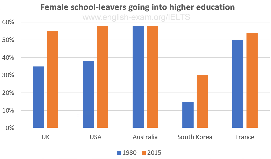
The
bar chart shows the percentage of females entering higher education in the
years 1980 and 2015. The chart shows the percentages in five countries, the UK,
the USA, Australia, South Korea and France.
Overall, the proportion of women in higher
education increased in the five countries. In general, there were more female
students in 2015 than in 1980, with more than half of women in higher education
in all of the countries apart from South Korea.
In four of the countries, the percentage of
women going into higher education rose. The most dramatic change was in South
Korea, where the percentage doubled from 15% to 30%. The smallest change was
seen in France, where the number increased only from 50% to 54%.
The only country in which there was not an
increase was Australia. Although the percentage of Australian women going into
higher education remained the same at 58%, this was the highest in 1980 and
equal highest with the USA in 2015.
(164 words)

No comments:
Post a Comment