Alternate
PTE Describe Image Template
The structure will include three parts.
1.
Introduction sentence – Introduction of the image stating
the X-axis or the image’s title. For example, “This graph shows…” or “The
diagram illustrates…”
2.
Key Points – Describe the key details. For graphs and
tables, discuss trends, comparisons, and data points. For maps or diagrams,
mention significant features or steps. For photographs, talk about what you see
and any implications.
3.
Conclusion – Drawing the logical conclusion to give an
overview or prediction from the data. For example, “In conclusion, this graph
indicates a significant increase in…” or “Overall, the diagram demonstrates
how…”
Some extra dose of information
- There will be a countdown of 25 seconds before the
microphone opens up to submit your answer. In those 25 seconds, try to
understand the image as deeply as possible.
- You have only one chance to record your response.
- Avoid spending too much time on less important
details.
- Don’t panic if you miss a point; keep your response
flowing.
- Try not to use fillers (um, ah, like) excessively;
it’s better to pause briefly if you need to think.
- Try to finish your response before the time ends up.
The image in front of me looks interesting and
fascinating. It provides valuable information about [mention the title or
topic of the image].
Looking at the image carefully, it can be seen
that [describes the main trend or feature]. The highest value is
observed in [mention the leading category or peak point], whereas the
lowest is seen in [mention the smallest or least significant one].
Moreover, there is a noticeable difference
between [compare two key items or trends], which indicates [give a
short interpretation or pattern]. Overall, the data shows a clear trend of [rising/falling/fluctuating/increasing
proportionally, etc.].
In conclusion, the image gives a clear and
detailed overview of [summarize the topic again], and it helps to
understand [mention key insight or importance].
Example (for a Bar Graph on Internet Users)
The
image in front of me looks interesting and fascinating. It provides valuable
information about the percentage of internet users in different countries.
Looking
closely, it can be seen that the highest percentage is in the USA, while the
lowest is in India. Moreover, the data shows that developed countries generally
have higher internet usage compared to developing ones.
Overall,
the image gives a clear idea about global internet penetration, highlighting
the digital divide between regions.
1. Bar Graph Template
The image in
front of me looks interesting and fascinating.
It shows information about [topic].
From the graph, it is clear that [highest category] has the maximum
value, while [lowest category] has the minimum.
Overall, there is a clear comparison among different groups, and it highlights
that [general trend or conclusion].

The image in front of me looks interesting and fascinating.
It shows information about the holiday accommodation chosen by British people in 2010 across four countries: England, Scotland, Wales, and Northern Ireland. From the graph, it is clear that hotels have the maximum value, as more than 40 percent of people in each country preferred to stay in hotels, while caravans in England have the minimum, with only about 5 percent choosing them.
Overall, there is a clear comparison among different accommodation types, and
it highlights that most British people preferred staying in hotels rather than
other options.
2. Pie Chart Template
The image in
front of me looks interesting and fascinating.
It represents the percentage distribution of [topic].
The largest portion belongs to [main section], followed by [next
section], while [smallest section] has the least share.
In general, the chart gives a clear idea about the proportion of each category.
The image in front of me looks
interesting and fascinating.
It represents the percentage distribution of holiday accommodations chosen by
British people in 2010 across England, Scotland, Wales, and Northern Ireland.
The largest portion belongs to hotels, followed by self-catering and camping,
while caravans have the least share.
In general, the chart gives a clear idea about the proportion of people
preferring different types of holiday accommodation.
3. Line Graph Template
The image in
front of me looks interesting and fascinating.
It illustrates changes in [topic] over a period of time.
Initially, [mention starting trend], and then it [increases/decreases/fluctuates].
The highest point appears in [time or category], whereas the lowest is
seen in [time or category].
Overall, the trend shows [steady growth/decline/fluctuation].
4. Table Template
The image in
front of me looks interesting and fascinating.
It presents data related to [topic].
Among all the figures, [highest value] is the highest and [lowest
value] is the lowest.
Overall, the table gives clear numerical details and helps in comparing
different categories effectively.
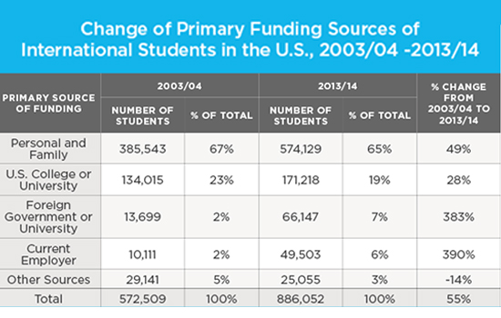
The image in front of me looks
interesting and fascinating.
It presents data related to the change in primary funding sources for
international students in the U.S. between 2003-2004 and 2013-2014.
Among all the figures, personal and family funding is the highest, while
funding from other sources is the lowest.
Overall, the table gives clear numerical details and helps in comparing
different categories of financial support effectively.
5. Process Diagram Template
The image in
front of me looks interesting and fascinating.
It explains the process of [topic].
The process starts with [first stage] and passes through several stages
like [next steps] before ending with [final stage].
Overall, it clearly shows how the process takes place step by step.
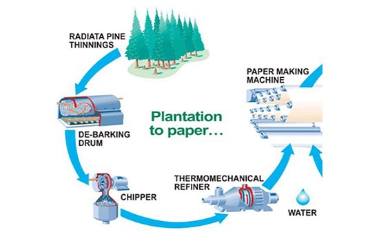
The image in front of me looks
interesting and fascinating.
It explains the process of making paper from trees.
The process starts with trees being placed in the debarking drum and passes
through several stages like chipping, thermo mechanical refining, and
paper-making before ending with the production of paper bundles.
Overall, it clearly shows how the process takes place step by step, converting
raw trees into finished paper.
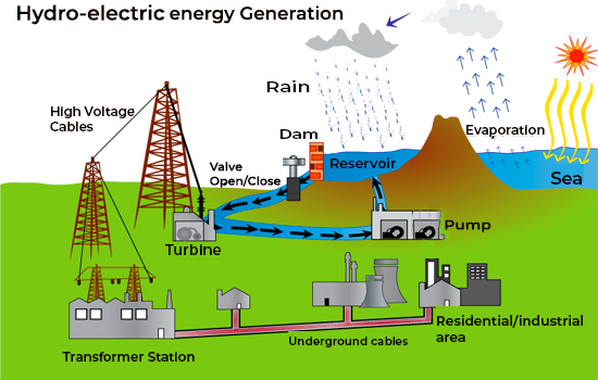
The image in front of me looks
interesting and fascinating.
It explains the process of hydroelectric power generation.
The process starts with the evaporation of seawater and continues with the
collection of rainwater in reservoirs and dams. It then passes through stages
involving pumps and turbines to generate electricity, which is transmitted via
high-voltage cables to transformer stations. Finally, underground wires
distribute the electricity to residential and industrial areas.
Overall, it clearly shows how hydroelectric energy is produced and supplied
through a series of systematic stages.
6. Map Template
The image in
front of me looks interesting and fascinating.
It shows the layout or geographical features of [place or area].
Important landmarks include [main features], and there are noticeable
differences between [area A] and [area B].
Overall, the map provides a clear visual description of the location and its
key elements.
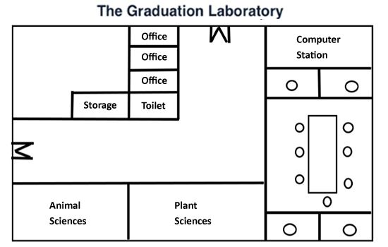
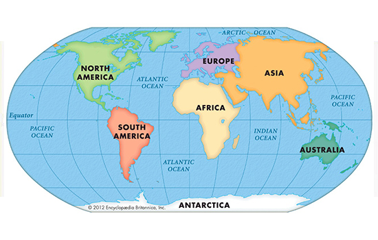
The image in front of me looks
interesting and fascinating.
It represents the map of a graduation laboratory.
From the map, it is clear that there are two entrance gates in the laboratory.
The southwest section contains books on animal and plant sciences, while a
large computer station occupies the entire northeast and southeast areas.
Overall, the map shows that the laboratory is well-organized, with a clear
division between book sections and computer labs.
The picture shows
information about the plantation on paper. It can be seen from the picture that
trees have to go through the debarking drum, chipper, Thermomechanical refiner,
and paper-making machine to finally convert from trees to paper. Overall, there
are several stages to convert a tree into a bundle of paper.
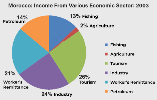
The pie chart represents Morocco’s income
from various economic sectors for 2003. It can be seen that the various economic
sectors listed here are Fishing, Agriculture, Petroleum, workers’ Remittances,
Industry, and Tourism. Furthermore, Morocco’s maximum income was from Tourism,
i.e., 26%. The minimum percentage of income obtained was from agriculture,
which was 2%. Overall, it can be concluded that Morocco has more tourist
attractions Places.
This diagram shows the
process of hydroelectric power generation. The process starts with the
evaporation of seawater, which is followed by the collection of rainwater in
reservoirs and dams. After that, with the help of a pump and turbine, the
electricity is generated and passed through high voltage cables to the
transformer stations. Finally, with the help of underground wires,
hydroelectric energy is distributed to the residential and industrial areas.
Overall, several stages are involved in the electric production of seawater.
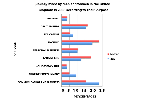
The bar graph represents the percentage
of men and women who made journeys in the United Kingdom in 2006 for various
purposes like commuting and business, shopping and walking. It can be seen that
for men, the maximum percentage of the journey was done for commuting and
business, which was around 24%, and this ratio stood the same for women, but
the purpose was shopping. On the other hand, only 4% of the journeys were made
for walking and holiday trips by both men and women. Overall, the main reasons
were commuting, business, and shopping for both men and women.
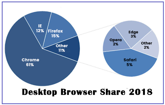
The Pie chart here
represents the desktop browser share for the year 2018. Various browsers like
Chrome, Internet Explorer, Firefox, and other categories are listed here. It
can be seen that the maximum number of users, i.e., 61 %, preferred Google
Chrome. Firefox is observed to be the second most popular after Chrome.
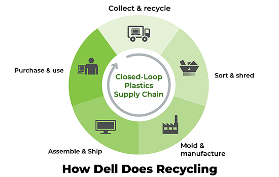
This diagram explains the
closed-loop plastics supply chain that represents Dell’s recycling process. It
begins with collecting and recycling products, and then it is sent for sorting
and shredding. Following that, the parts are then molded and manufactured at
the plant. In the next step, all the computer parts are assembled and made
ready to be shipped. Finally, Dell computers are ready for purchase and sale.
Overall, the recycling process is divided into five main stages.
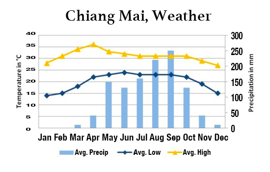
This combination of bar and line graph
represents the temperature in Celsius and precipitation in mm of Chiang Mai
City from January to December. It can be seen that the maximum temperature of
approximately 34 degrees Celsius was observed in September. Furthermore, the
highest figures for an average high of 252mm and an average low of 170mm in
precipitation were noted in April. Overall, there is a fluctuation seen in the
figures for temperature and precipitation during a year.
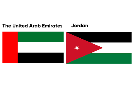
The Image represents the
Flag of Two Countries. It can be seen that the Flag of UAE is on the left, and
the Flag of Jordan is on the Right. Also, talking about the similarities of the
flags, they have common colors, i.e., Red, Green, White, and Black. The flag of
the UAE is formed of four Rectangular blocks, while Jordan country\u2019s flag
is composed of 3 rectangles and one triangular shape. Overall, it can be said
both countries share the same color, following different shapes with red.
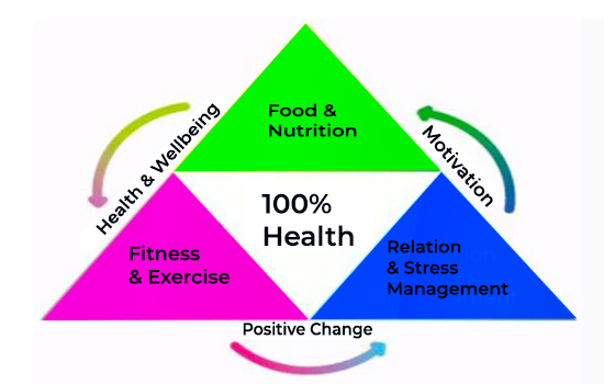
The Picture represents the
pyramidal graph, explaining the trick of maintaining a 100% healthy life. It
can be seen that following sufficient nutrients in your diet, adding exercise
to your routine, and maintaining proper relaxation are mandatory to maintain a
healthy body. Also, in addition to proper well-being, upbringing, positive
changes, and staying motivated are required to get these things done. Overall,
it can be said that staying fit, eating, exercising, and getting proper sleep
is imperative.
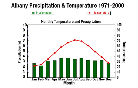
The image represents
Albany’s precipitation rate and temperature from 1971 to 2000. It can be seen
that the precipitation rate goes maximum up to 3.5 inches. Furthermore, the
temperature is observed to increase gradually from January, and after six
months, the temperature starts to decline slowly. Overall, it can be seen that
there is minimal difference in the precipitation rate, and the temperature is
warmer in July month.
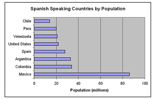
The bar graph represents
the Spanish-speaking countries by population. The X-axis represents the
population in millions, and the Y-axis represents the countries. Also, it is
observed that Mexico has 85 million people speaking Spanish, which is the
highest of all countries shown, and the lowest number of Spanish-speaking
people is found in Chile. Overall, countries like Mexico, Argentina, and
Colombia are expected to have more Spanish-speaking populations in the future.
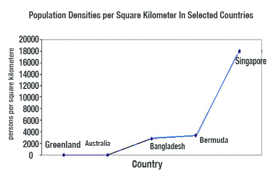
The line graph represents five different
countries’ population densities per square kilometer. It can be seen that the
x-axis represents the country, and the y-axis represents the persons per square
kilometer. The maximum number of people in Singapore is 18,000 per square
kilometer. In contrast, the lowest percentage of population densities is
observed in Bangladesh, which is 3000 people per square Kilometre. Overall,
Greenland and Australia have close to zero population.
1. Bar Graph Sample
Topic: Average Monthly Rainfall in Four
Cities
Sample Answer:
The image in front of me looks interesting and
fascinating. It shows information about the average monthly rainfall in four
cities: London, Sydney, Mumbai, and Cairo. From the graph, it is clear that
Mumbai receives the highest rainfall, while Cairo has the least. London and
Sydney have moderate amounts.
Overall, the graph highlights that tropical
regions get more rainfall than desert areas.
2. Pie Chart Sample
Topic: Energy Consumption by Sector
Sample Answer:
The image in front of me looks interesting and
fascinating. It represents the percentage distribution of energy use by
different sectors. The largest portion belongs to the industrial sector,
followed by transportation and residential use. The commercial sector consumes
the least.
Overall, the chart clearly shows that
industries are the main consumers of energy.
3. Line Graph Sample
Topic: Population Growth from 2000 to 2020
Sample Answer:
The image in
front of me looks interesting and fascinating.
It illustrates changes in population from 2000 to 2020.
Initially, the population was around 5 million and gradually increased over
time.
The highest point appears in 2020, whereas the lowest is seen in 2000.
Overall, the trend shows steady growth throughout the period.
4. Table Sample
Topic: Literacy Rate in Five Countries
Sample Answer:
The image in front of me looks interesting and
fascinating. It presents data related to literacy rates in five different
countries. Among all, Japan has the highest rate of 99%, while Nepal has the
lowest at 70%. The others fall in between.
Overall, the table gives clear numerical
details showing developed nations have higher literacy rates.
5. Process Diagram Sample
Topic: Water Cycle
Sample Answer:
The image in front of me looks interesting and
fascinating. It explains the process of the water cycle. The process starts
with evaporation from oceans, followed by condensation forming clouds, and then
precipitation as rain. Finally, water flows back to rivers and seas.
Overall, it clearly shows how water continuously circulates in nature.
6. Map Sample
Topic: Map of a City Park Before and After
Development
Sample Answer:
The image in front of me looks interesting and
fascinating. It shows the layout of a city park before and after modernization.
Initially, the park had open grass areas, but new facilities like a café,
playground, and car park were later added.
Overall, the map highlights significant
improvements made for public convenience.

No comments:
Post a Comment