PTE Describe Image
The structure will include three parts.
1.
Introduction sentence – Introduction of the image stating
the X-axis or the image’s title. For example, “This graph shows…” or “The
diagram illustrates…”
2.
Key Points – Describe the key details. For graphs and
tables, discuss trends, comparisons, and data points. For maps or diagrams,
mention significant features or steps. For photographs, talk about what you see
and any implications.
3.
Conclusion – Drawing the logical conclusion to give an
overview or prediction from the data. For example, “In conclusion, this graph
indicates a significant increase in…” or “Overall, the diagram demonstrates
how…”
Some extra dose of information
- There will be a countdown of 25 seconds before the
microphone opens up to submit your answer. In those 25 seconds, try to
understand the image as deeply as possible.
- You have only one chance to record your response.
- Avoid spending too much time on less important
details.
- Don’t panic if you miss a point; keep your response
flowing.
- Try not to use fillers (um, ah, like) excessively;
it’s better to pause briefly if you need to think.
- Try to finish your response before the time ends up.
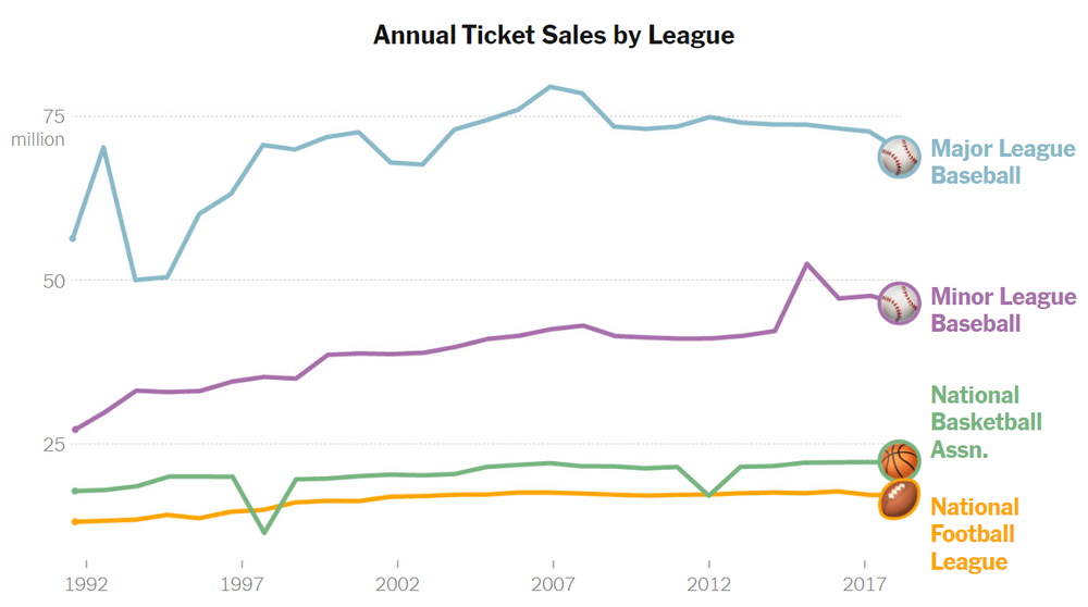
The graph displays annual ticket sales for
major sports leagues from 1992 to around 2017. The data provides a comparative
overview of the popularity and audience engagement of these leagues. Major
League Baseball leads with the highest sales, peaking just below 80 million
tickets. Minor League Baseball follows a steady trend around 40 million, until
a recent, yet brief, spike around 2014. The National Basketball Association and
the National Football League (NFL) show more modest, stable sales figures, both
generally maintaining between 15 to 25 million tickets sold annually.
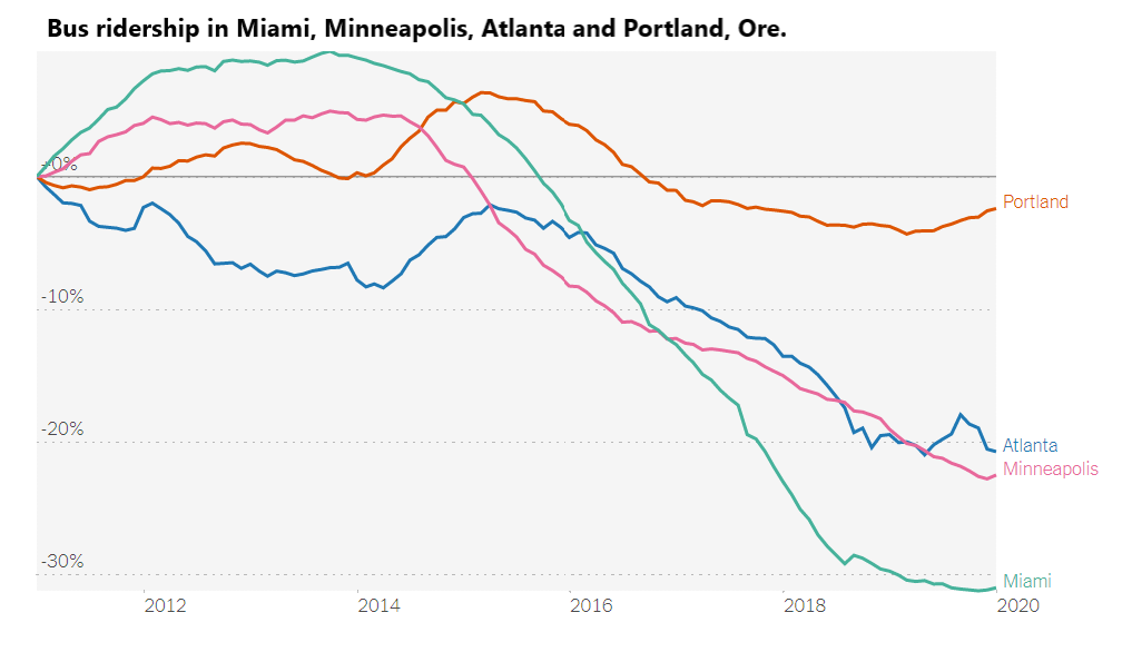
The graph depicts trends in bus ridership changes from
approximately 2011 to 2020 in Miami, Minneapolis, Atlanta, and Portland,
Oregon. Miami shows a dramatic decrease in ridership, dropping by more than
30%. Minneapolis and Atlanta exhibit similar patterns, both with significant
declines, though not as severe as Miami's drop. Portland's ridership remains
relatively stable, experiencing a minor decrease compared to the others.
Overall, the graph illustrates a broad decline in bus ridership in these cities,
with Portland maintaining the most stable trend over the period.
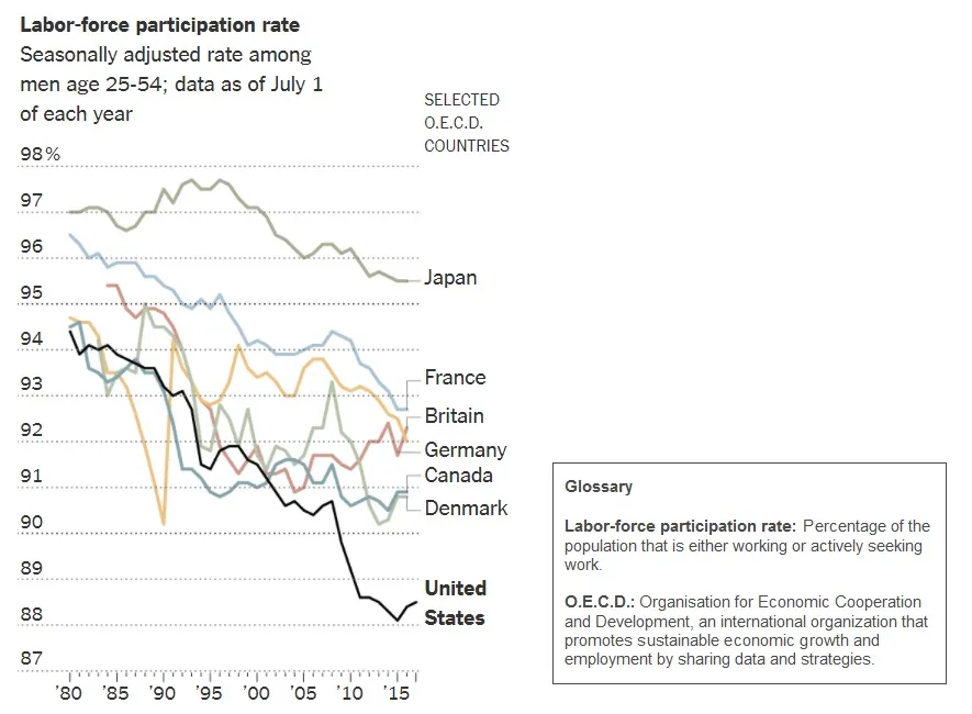
The graph displays the labor-force
participation rate among men aged 25-54 in selected OECD countries from 1980 to
2017. All countries in the chart show a decline during this period, though the
magnitude of the declines varies between countries. Japan maintains the highest
rates throughout. Other nations, including France, Britain, Germany, Canada,
and Denmark dropped less than 5 percentage points. However, the United States
exhibits a more significant decline in participation rates, falling from near
95% in 1980 to approximately 88% by 2015.
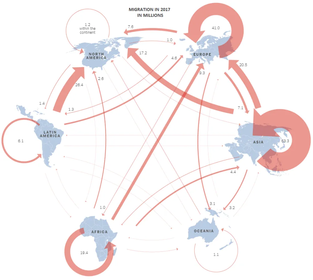
This info graphic illustrates global migration
patterns in 2017, highlighting the movement of millions of people between and
within continents. Notable flows include 63.3 million people migrating within
Asia, 41 million within Europe, and 26.4 million within North America. There
were also significant flows from Latin America to North America (26.4 million)
and from Asia to Europe (20.5 million). Generally speaking, there was more
migration from regions with more developing countries like Africa, Asia, and
Latin America to more developed regions like North America and Europe than
vice-versa.

The bar chart illustrates global pet food sales
from 2010 to 2023, expressed in billions of U.S. dollars. The sales have shown
an overall increasing trend over the years. Starting at $59.3 billion in 2010,
there's a steady growth, with a slight dip in 2016 and 2017. The sales rebound
and grow at an even faster rate, peaking at $133.9 billion in 2023. Over the
span of just 13 years, sales of pet food have more than doubled globally.
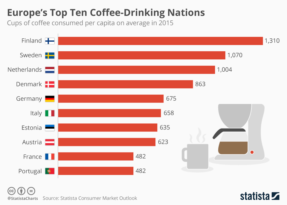
This bar chart displays Europe's top ten
coffee-drinking nations based on cups of coffee consumed per capita in 2015. In
general, coffee consumption varies significantly between the countries. Finland
leads significantly with 1,310 cups per person, followed by Sweden at 1,070,
and the Netherlands with 1,004 cups. Denmark and Germany consume 863 and 675
cups respectively, showing moderate consumption. Italy, known for its coffee
culture, surprisingly consumed just 658 cups. Estonia, Austria, France, and
Portugal also make the list, each consuming between 482 and 635 cups per capita.
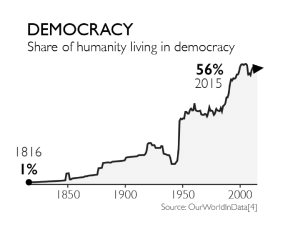
This line graph illustrates the percentage of the world's
population living under democratic governments from 1816 to 2015. In 1816, only
1% of humanity lived in democracies. The share remained relatively low until a
noticeable increase starting around 1900. Significant growth in global
democracy began around 1950 and continued to rise sharply through the late 20th
century. The trend reached its peak in 2015, with 56% of the global population
living in democratic nations. The chart highlights major gains in democracy
post-World War II and through the end of the Cold War.
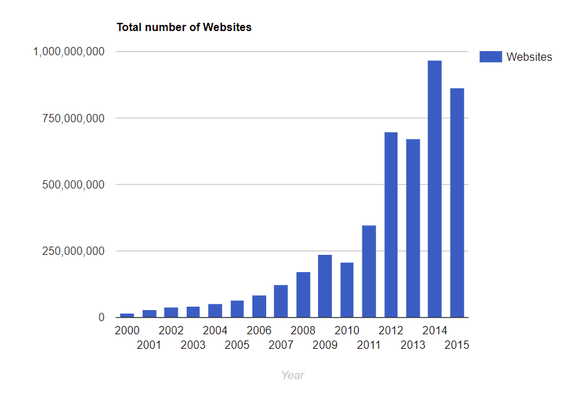
This bar graph displays the total number of websites from
2000 to 2015. The growth of websites is gradual from 2000 to 2006, with a
significant increase starting in 2007. In 2009, the number of websites
surpassed 250 million. By 2012, the number of websites had more than doubled,
reaching over 500 million. The most notable growth is between 2013 and 2014,
where the number of websites skyrocketed to nearly 1 billion, peaking in 2014.
The trend slightly declined in 2015 but remained close to 1 billion.
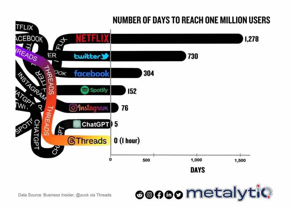
This bar graph displays the number of days it took various
platforms to reach one million users. Netflix took the longest at 1,278 days,
followed by Twitter with 730 days, and Facebook with 304 days. Spotify reached
the milestone in 152 days, while Instagram did so in 76 days. ChatGPT achieved
one million users in just 5 days. The most rapid growth was seen with Threads,
which reached one million users in 0 days, essentially within one hour. The
data highlights the accelerating pace at which new platforms can gain
significant user bases.
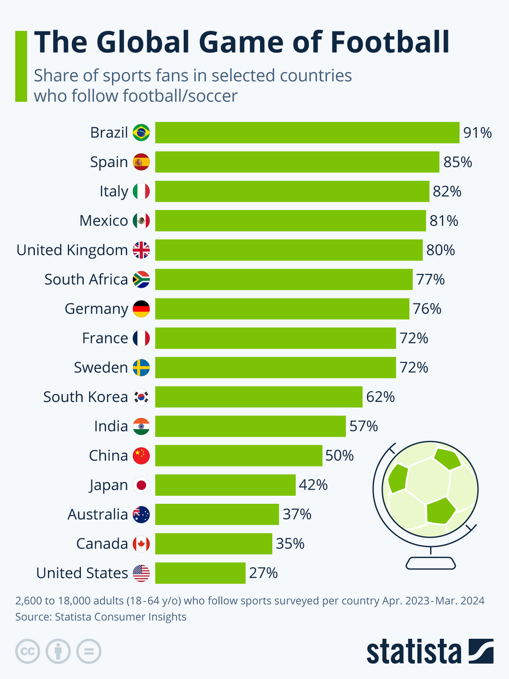
This bar chart shows the percentage of sports fans in
selected countries who follow football as of a survey conducted from April 2023
to March 2024. Brazil leads with 91% of its sports fans following football,
followed by Spain at 85%, and Italy at 82%. The United Kingdom and Mexico also
have high engagement rates at 80% and 81% respectively. In contrast, the United
States has the lowest percentage, with only 27% of sports fans following
football. Other countries like China, Japan, and Australia show moderate
interest levels.
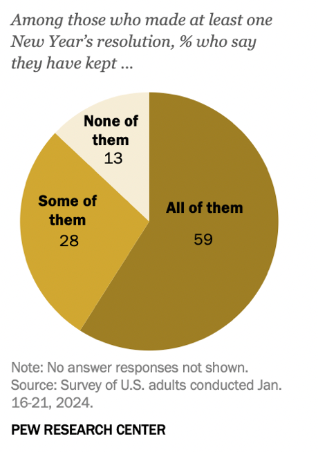
This pie chart from the Pew Research Center presents data
from a survey conducted in January 2024, detailing how U.S. adults have adhered
to their New Year's resolutions. Among respondents who made at least one
resolution, 59% reported that they have kept all of their resolutions, while
28% have kept some of them. Conversely, 13% admitted to not keeping any of
their resolutions. This data illustrates a relatively high rate of commitment
to New Year's resolutions among the surveyed group.
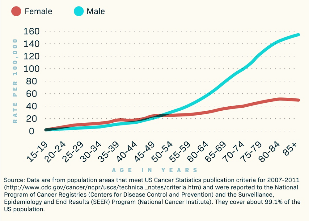
This line graph displays skin cancer incidence rates per
100,000 people, broken down by age and gender in the United States. The data
covers 99.1% of the US population, so it is impressively comprehensive. The
graph shows that rates increase with age for both males and females. Male
cancer rates are consistently higher than female rates, particularly noticeable
in older age groups. The graph highlights that the incidence rates for males
start to significantly diverge from females beginning in the 55-59 age group
and continue to increase steeply as age progresses.
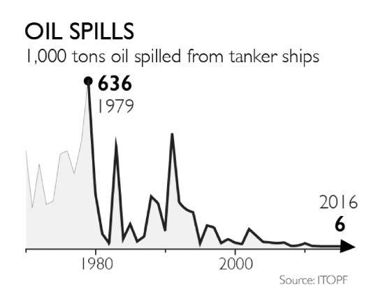
This line graph presents the amount of oil spilled from
tanker ships in thousands of tons, spanning from sometime before 1980 to 2016.
The graph shows a dramatic peak in 1979 with 636,000 tons spilled, marking the
highest point of oil spills. Following this peak, there are several significant
spikes, particularly noticeable through the 1980s. From the 1990s onward, the
frequency and volume of oil spills sharply decline, reaching a low of just
6,000 tons in 2016, indicating a substantial reduction in major oil spills from
tanker ships over the decades.
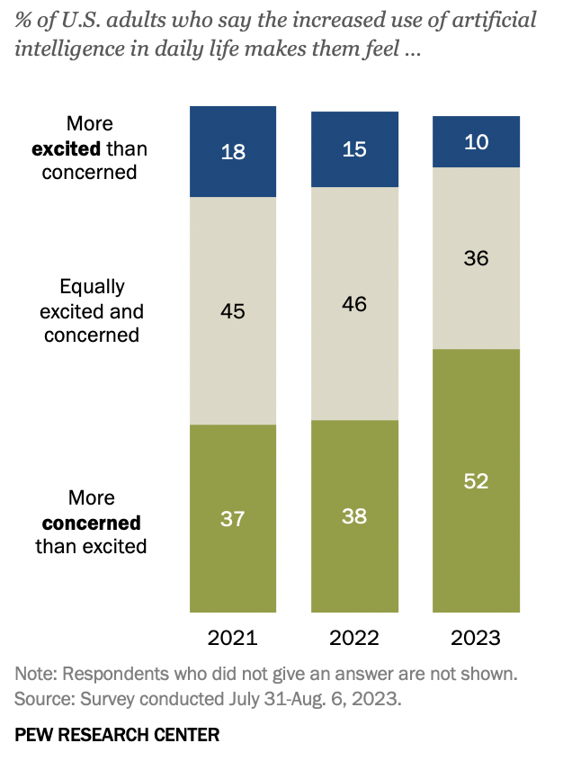
This bar chart from the Pew Research Center shows the
percentage of U.S. adults' feelings toward the increased use of artificial
intelligence (AI) in daily life, surveyed from 2021 to 2023. In 2021, 18% felt
more excited than concerned, decreasing to 10% by 2023. Those equally excited
and concerned remained stable at 45% in 2021 and 46% in 2022, then dropped to
36% in 2023. Meanwhile, the proportion more concerned than excited rose from
37% in 2021 to 52% in 2023, indicating growing apprehension about AI among U.S.
adults over these years.
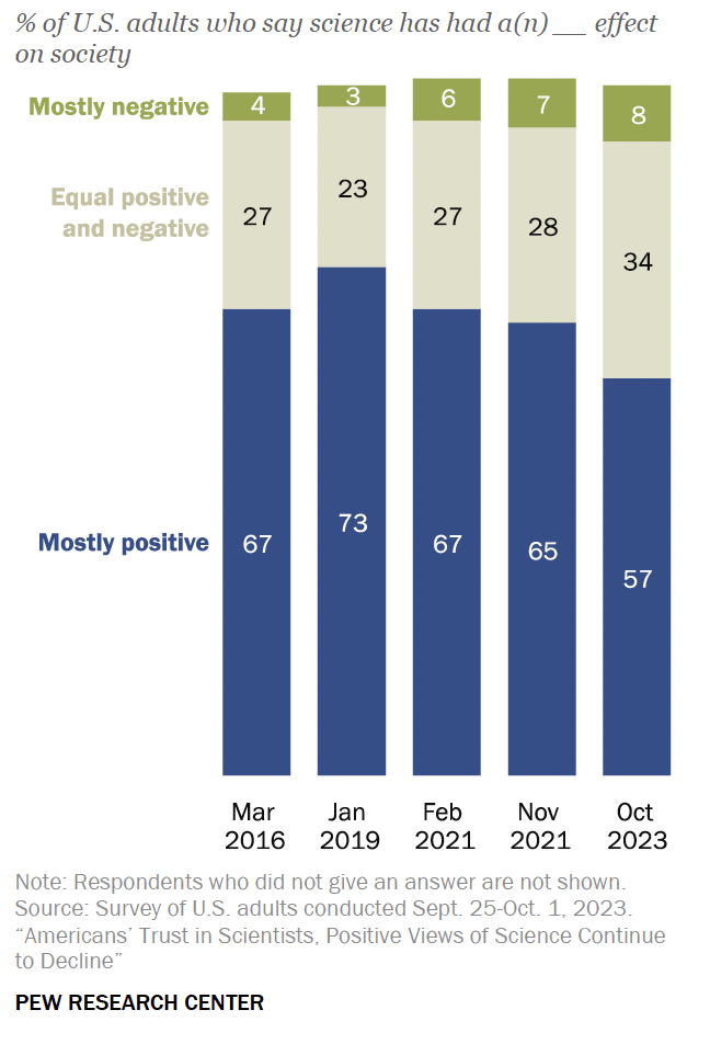
This stacked bar chart displays the percentages of U.S.
adults who believe science has had a mostly positive, equal positive and
negative, or mostly negative effect on society, across five different surveys
from March 2016 to October 2023. The proportion of adults viewing science as
mostly positive declined from 67% in March 2016 to 57% in October 2023. The
percentage seeing science as equally positive and negative increased slightly
over the years, while the view of science as mostly negative grew from 4% in
2016 to 8% in 2023. My broad inference from the chart is that respect for science
has been on the decline.
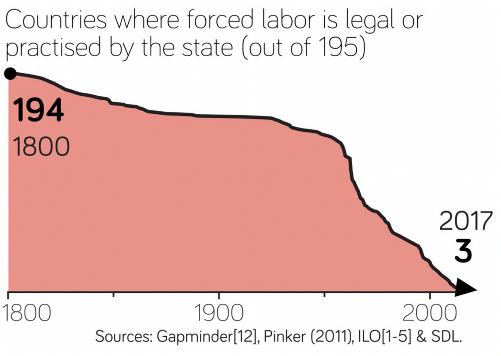
This line graph
illustrates the decline in the number of countries where forced labor is legal
or practiced by the state from 1800 to 2017. In 1800, 194 out of 195 countries
legally or officially practiced forced labor. Over time, this number gradually
decreased, showing a significant decline particularly in the 20th century, and
reaching a low of 3 countries by 2017. This demonstrates a substantial global
reduction in the acceptance and practice of state-sanctioned forced labor over
the past two centuries.

No comments:
Post a Comment