PTE Describe Image
The structure will include three parts.
1.
Introduction sentence – Introduction of the image stating
the X-axis or the image’s title. For example, “This graph shows…” or “The
diagram illustrates…”
2.
Key Points – Describe the key details. For graphs and
tables, discuss trends, comparisons, and data points. For maps or diagrams,
mention significant features or steps. For photographs, talk about what you see
and any implications.
3.
Conclusion – Drawing the logical conclusion to give an
overview or prediction from the data. For example, “In conclusion, this graph
indicates a significant increase in…” or “Overall, the diagram demonstrates
how…”
Some extra dose of information
- There will be a countdown of 25 seconds before the
microphone opens up to submit your answer. In those 25 seconds, try to
understand the image as deeply as possible.
- You have only one chance to record your response.
- Avoid spending too much time on less important
details.
- Don’t panic if you miss a point; keep your response
flowing.
- Try not to use fillers (um, ah, like) excessively;
it’s better to pause briefly if you need to think.
- Try to finish your response before the time ends up.
Sample 1
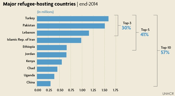
The image shows a bar chart about major
refugee-hosting countries as of the end of 2014.
Overall, it gives information about the number of
refugees hosted by different countries worldwide.
From the image, it can be seen that Turkey leads
with the highest number of refugees, followed by Pakistan and Lebanon.
In contrast, the next two
countries, the Islamic Republic of Iran and Ethiopia, host fewer refugees
individually.
Moreover, the inclusion
of Jordan, Kenya, Chad, Uganda, and China rounds out the top ten, which
together accommodate 57% of the global refugee population.
Finally, it can be concluded that the top ten
countries collectively host more than half of the world's refugees, highlighting
the uneven global distribution of refugees, as reported by UNHCR.
Or,
This bar chart illustrates the major refugee-hosting
countries as of the end of 2014. Turkey leads with the highest number of
refugees, followed by Pakistan and Lebanon. These top three countries
collectively host 30% of the world's refugees. The next two countries, the
Islamic Republic of Iran and Ethiopia, bring the total hosted by the top five
countries to 41%. The inclusion of Jordan, Kenya, Chad, Uganda, and China
rounds out the top ten, which together accommodate 57% of the global refugee
population, as reported by UNHCR.
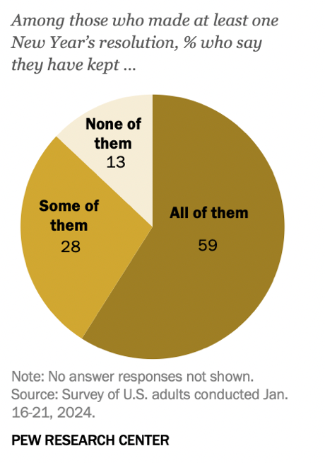
This pie chart from the Pew Research Center
presents data from a survey conducted in January 2024, detailing how U.S.
adults have adhered to their New Year's resolutions. Among respondents who made
at least one resolution, 59% reported that they have kept all of their
resolutions, while 28% have kept some of them. Conversely, 13% admitted to not
keeping any of their resolutions. This data illustrates a relatively high rate
of commitment to New Year's resolutions among the surveyed group.a
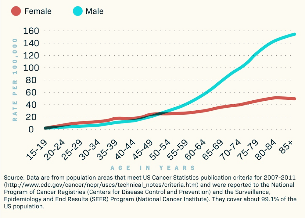
This line graph displays skin cancer incidence rates per
100,000 people, broken down by age and gender in the United States. The data
covers 99.1% of the US population, so it is impressively comprehensive. The
graph shows that rates increase with age for both males and females. Male
cancer rates are consistently higher than female rates, particularly noticeable
in older age groups. The graph highlights that the incidence rates for males
start to significantly diverge from females beginning in the 55-59 age group
and continue to increase steeply as age progresses.
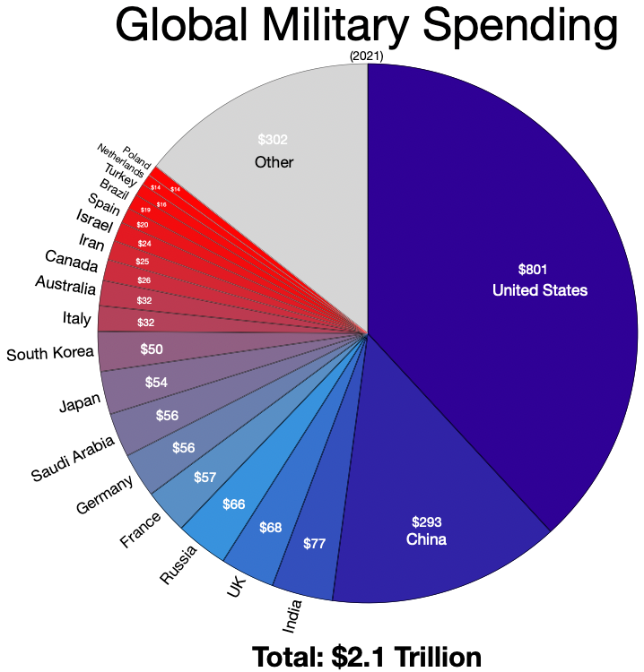
This pie chart details global military spending for the year
2021, totaling $2.1 trillion. The United States leads with a significant
portion, spending $801 billion, which is far more than any other country. China
follows with $293 billion. Other major contributors include India ($77
billion), the UK ($68 billion), Russia ($66 billion), and France ($57 billion).
Countries like Saudi Arabia, Japan, Germany, and South Korea also feature, each
spending between $50 and $57 billion. The segment labeled "Other" sums
up $302 billion, accounting for the combined spending of numerous other
countries. This visualization underscores the substantial disparity in military
expenditures between the U.S. and the rest of the world.
Sample 6
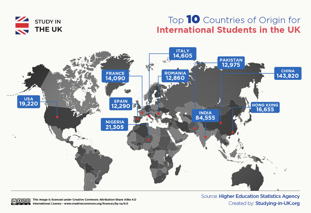
The map visualizes the top 10 countries of origin for
international students studying in the UK. It highlights China as the leading
source with 143,820 students, followed by India with 84,555 students. Other
notable countries include Nigeria (21,305), the USA (19,220), Hong Kong
(16,655), France (14,090), Italy (14,605), Romania (12,860), Pakistan (12,975),
and Spain (12,290). Interestingly, no data is shown for any countries in Latin
America, suggesting that there are not many students from that region who study
abroad in the UK.
Sample 7
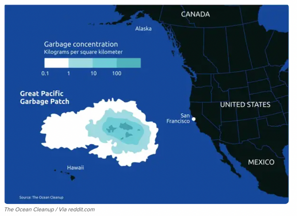
The image depicts the Great Pacific Garbage Patch, located
between Hawaii and the western coast of North America. It is alarmingly large.
The image highlights the concentration of garbage in the ocean, measured in
kilograms per square kilometer. The garbage concentration ranges from 0.1 to
over 100 kilograms per square kilometer, with the densest areas shown in darker
shades of blue. The map provides a visual representation of the significant
accumulation of marine debris in the central North Pacific Ocean, emphasizing the
severity of oceanic plastic pollution.

No comments:
Post a Comment