
What is a Line Graph?
A line graph also known as a line
chart is a type of chart used to visualize the value of something over time.
When
the Line Graph is used?
These are used to track the
changes over short and longer time periods. Moreover, the line graph is
the best choice when the changes are smaller. Additionally, it can be used to
compare the changes over the same time period for more than one group. The
IELTS line graph consists of horizontal (X-axis) and Vertical (Y-axis). Usually, the x-axis shows the time period and the
y-axis shows the measurements.
How to describe a Line graph in IELTS?
In the
line graph, you will find two types of graphs- one is the simple line graph and
the other is complex. The simple graph question includes one line whereas the
complex one includes two or more lines. Furthermore, these lines can be of
various types and colors.
|
You should spend
about 20 minutes on this task. The graphs below provide information on global population
figures and figures for urban populations in different world regions. Summarise the information by selecting and reporting the main
features, and make comparisons where relevant.
|
Write
at least 150 words.
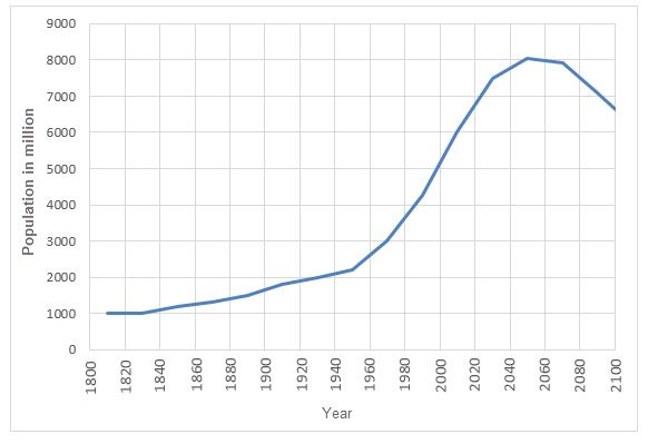
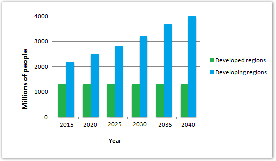
The
provided illustrations show information on the world population from 1800 to
2100 and the distribution of this population in developed and developing
regions.
Overall, the global population would continue to
rise until 2050 and the majority of the people would be living in developing
regions while the population in the developed countries will remain almost the
same.
As per
the line graph, the global population increased comparatively slowly from 1800
to 1940 and reached over 2000 million in 1940. This was followed by a drastic
rise to 6000 million by the year 2000. The graph shows the projection that this
rapid growth of population will continue until 2040 when the population would
be over 8000 million. However, after that, it would fall to around 6000 million
in 2100.
According
to the bar graph, around 1200 million people lived in developed countries in
2015 and this figure would remain unaffected until 2040. On the contrary, over
2000 million lived in developing countries in 2015 and the population in these
areas are expected to be double by the final year 2040.
(180
words)
Sample 3
|
ou should spend about 20
minutes on this task. The
graph below shows the number of books read by men and women at Burnaby Public
Library from 2011 to 2014. Summarise the information by selecting and reporting the main features, and make comparisons where relevant. |
Write
at least 150 words.
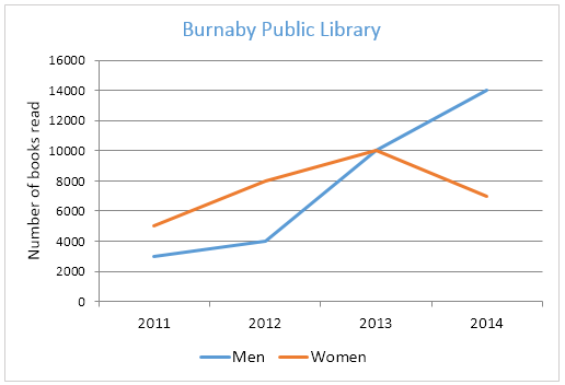
The graph gives information about
Burnaby Public Library between 2011 and 2014. It shows how many library books
people read over this four-year period.
Overall, there was a
strong upward trend in the number of books read by men. Although women read
more books than men in 2011, their reading fell to below the level of men in
2014.
As can be seen from the
graph, there were different trends for men and women. The number of books read
by men increased steadily between 2011 and 2012, from about 3000 to 4000. After
that, the number rose dramatically to 14000 books in 2014. This was the highest
figure in the period.
Women started off reading
more books than men, but their numbers followed a different pattern. Between
2011 and 2012, there was an increase of 3000 from 5000 books to 8000 books, and
then a gradual rise to 10000 books in 2013. However, in 2014, their numbers
fell back to 8000 again.
(162 words)
Sample 4
|
You should spend about 20 minutes
on this task. The line graph shows thefts per thousand vehicles in four
countries between 1990 and 1999.Summarize the information by selecting and reporting the main
features, and make comparisons where relevant. You should write at least 150 words. |
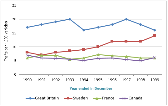
The line graph
illustrates car thefts in the UK, Sweden, France and Canada from 1990 to 1999.
In general,
despite some fluctuations, car theft almost remained the same in Great Britain,
France and Canada While the rate in Sweden rose during the period given.
In 1990, the rate
of stealing cars in France and Canada were about 6 and 7 subsequently. Then
they both experienced some ups and downs to be stable at nearly the same amount
at the end of the period. In addition to that, car theft in the UK was almost
18 in 1990, then the rate underwent some fluctuations that made a slight change
to become about 17 in 1999.
On the other
hand, the number of stolen cars in Sweden was about 8 in 1990 and then it
showed a steady rise to 1996. From 1996 it remained the same until 1998 which
followed by another a gradual growth to be to hit nearly 14 at the end of the
period.
(166 words)
Sample 5
|
You should spend about 20
minutes on this task. The
graph below shows population figures for India and China since the year 2000 and
predicted population growth up until 2050. Summarise
the information by selecting and reporting the main features, and make
comparisons where relevant. Write at least 150 words. |
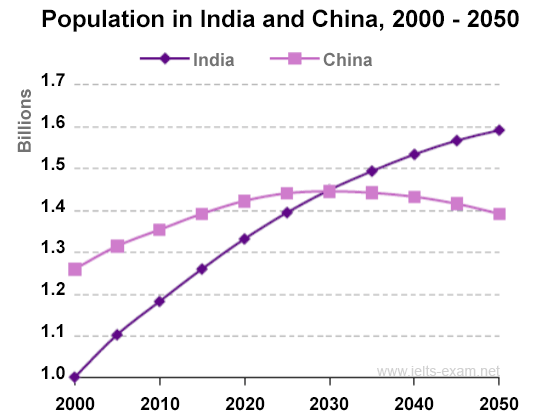
The graph shows how the
populations of India and China have changed since 2000 and how they will change
in the future.
Overall, India’s
population seems to be ascending at a steady pace, whereas China’s population
rate becomes stagnant after a while. A highlight of the graph is that India and
China record the same population data in the year 2030.
In 2000, there were more people
living in China than in India. The number of Chinese was 1.25 billion, while
India's population was about 1 billion. Between 2000 and 2010, there has been a
0.2 billion rise in the number of Indian citizens. Over the same period,
China's population has increased by 0.1 billion to reach over 1.35 billion.
According to the graph, the
population in India will increase more quickly than in China, and experts say
that by 2030, both countries will have the same population of 1.45 billion.
After this, China's population is likely to fall slightly to 1.4 billion in
2050, while India's population will probably increase and reach 1.6 billion.
(175 words)

No comments:
Post a Comment