
A table chart is nothing
but another way to present information. The table contains words, numbers, or a
combination of both displayed in boxes or columns. It illustrates a set of
facts and the association between them.
Moreover, there can be a
single table or a combination of two. It can even be a combination of another
diagram such as a line chart, bar chart, or pie chart.
You should need to do as
shown:
·
Describe the information presented in a
table
·
Compare and contrast
·
Report on an impersonal topic without
giving your opinion
·
Use appropriate language to the table
description
Sample 1
You should spend about 20 minutes on
this task.
The table below gives information about rail transport in four countries
in 2007.
Summarise the information by selecting and reporting the main features, and make comparisons where relevant.
Write at least 150 words.
The table compares the data of railway networks in four
countries, namely- Malaysia, Canada, China and the UAE in the year of 2007.
Overall, it is clear that railway was more widely used by
Chinese passengers, whereas in Canada, it was used primarily for freighting
goods.
Now getting back to the details, a large number of people in
China travelled by train which accounted for 27 million in 2007, dominating
that of the other countries. The highest out of four, the average travelling
distance of Chinese was approximately three times higher than the corresponding
number of Malaysian (770 kilometres). By contrast, rail in Canada carried a
vast amount of loads (28.20 tonnes) but a mere 0.3 million travelers.
It is also noticeable that railway in Malaysia and UAE shared
nearly the same patterns in all three categories. The former served 5.9 million
customers in 2007, while that figure for the latter was slightly lower, 5.5
million. Likewise, there was hardly any difference between the amount of
freight carried by train in both countries, accounted for 22.2 tones and 21.9
tones respectively.
Sample 2
|
You should spend about 20 minutes on this task.\ The table below gives information about past and projected population figures in various countries for different years. Summarise
the information by selecting and reporting the main features, and make
comparisons where relevant. |

The given table
illustrates information about demographic statistics in four countries, namely
Australia, Canada, New Zealand and the United States, between the year 1990 and
2050.
Overall,
all four countries saw an upward trend despite New Zealand grew at less lower
rate. Every country is forecasted to higher rate of population growth over the
period.
It is clear from the chart
that United states have highest proportion of population till 2000.The rate of
population at starting was 249.9 million and 275.1 million in 2000.it is
predicted that it will remained highest with 349 million in 2050.The country with
lowest projection growth rate in new Zealand with 3.4 million in 1990 and will
reach to 4.7 million in 2050.
Furthermore, the number of
population in Canada was 26.6 million in starting and it was just above one
third million in 2000.It will rise to 39 million in 2050 whereas in Australia,
The rate of population was 17.1 million in 1990 and gradually it increased in
each years. The growth of population was 26 million in the year 2050.
(176 words)
Sample 3

The tables
provide data about male and female rates of full-time and part-time working in
three European countries in 2002 and compare them to the European average.
Overall, it can
be seen that men worked longer hours in both full and part-time in Greece and
the UK, while the Netherlands had some differences.
Greek men and
women worked the longest full-time hours, with figures of 42.5 hours for men
and 39.9 for women. On the other hand, UK male full-time workers only worked
37.5 hours and females only 37, which were the lowest figures in full-time
work. Men and women from the Netherlands both worked equally long hours (38.0),
while the European average was 40.4 for men and 39.2 for women.
For
part-time work, Greece was again at the top at 30 hours for men and 29.3 for
women. UK women once more worked the least number of hours at 28, although UK
men (29) worked more hours than men from the Netherlands (28.3). In fact, Dutch
women worked 29.2 hours in part-time work, which was the only category where
men were higher than women. Finally, the European average was noticeably higher
than any of the individual countries, recording percentages of 34 for women and
32 for men.
(208 words)
Sample 4
|
The table shows
the percentage of journeys made by different forms of transport in four
countries, The bar graph shows the results of a survey into car use. Summarise
the information by selecting and reporting the main features, and make
comparisons where relevant. Write
at least 150 words. |

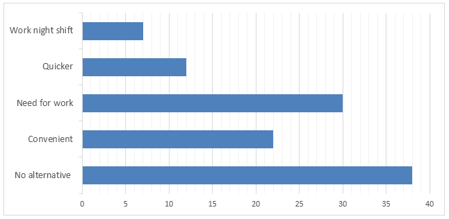
The table helps compare modes of transport used in
four countries: Canada, Belgium, Germany, and the Netherlands.
As evident from the table, cars are the most frequently
used transport form in all four countries.
However, the proportion
of journeys made by this vehicle ranges from a low of 47% in the
Netherlands to a high of 90% in Canada. Unsurprisingly,
Netherlands has a high proportion of trips made by bicycle, accounting
for 26% and on foot, which is 18%. Germany is the country with the
highest rate of public transport use, where approximately one in
five journeys is made by public transport.
The bar chart also depicts helpful information in
understanding the high use of the car in Canada. The most commonly quoted
reason is the absence of any other alternative (38%). Although 22% of
people said it is more convenient to travel through a car, the other
listed factors illustrate needs more than preferences, e.g. working night
shift.
Sample 5
You should spend about 20 minutes on
this task.
The table below gives information
about rail transport in four countries in 2007.
Summarise the information by selecting
and reporting the main features, and make comparisons where relevant.
Write at least 150 words.
The given table data shows the railway route,
passenger number and cargo goods carried in Malaysia, Canada, China and UAE in
the year 2007.
As is observed from the data, Chinese people
used the railway system more than the people of other countries but the cargoes
carried more goods in Canada among the given countries.
According to the data, 27 million people
used rail transports (excluding metro) in China compared to the just 5-6
million railway users in UAE and Malaysia. Only 0.3 million Canadian people
used railway transportations in 2007, which was least among the given four
countries. The distance passed by passengers who used railway in these four
countries was similar to the data provided for the railway passengers in these
four countries for the year 2007. Around two thousand km were passed by Chinese
people compared to the less than eight hundred km in UAE and Malaysia. As only
0.3 million Canadian people used railway in 2007, the distance passed by each
passenger was only 80 km which was the least among the figure given for four
countries.
Interestingly, the cargos that transported
goods carried the highest amount in Canada (over 28 tonnes) though the
passengers used railway system lesser than other countries. On an average, all
of the given four countries had an average of 21- 28 billion tonnes goods
carried through the railway system. In summary, Chinese
people used the railway more than the people of other country and cargo carried
more goods in Canada among the given countries.
Sample 6
You should spend
about 20 minutes on this task.
The table shows the worldwide market share of the mobile phone
market for manufactures in the years 2005 and 2006.
Summarise the information by selecting and reporting the main features, and
make comparisons where relevant.
Write at least 150 words.
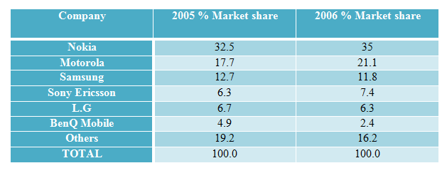
The table data shows the leading mobile phone manufacturers’
global market share in 2005 and 2006.
Generally speaking, Nokia had the highest
global market share of cell phone both in 2005 & 2006 and the market shares
of Nokia, Motorola and Sony Ericsson increased in 2006 than their share in
2005.
As is
presented, Nokia had the largest market share (one-third of total) in 2005 and
their market share increased by 2.5% next year. Motorola had the second highest
market share comprising over 17% in 2005 and their market share increase by
roughly 4%. Samsung had been able to maintain the third position for their
worldwide mobile phone market share, though their share decreased to 11.8% in
2005 compared to 12.7% in the previous year.
On the other hand, Sony Ericsson and L.G
both had more than 6% market share in 2005. In 2006, though Sony Ericsson’s
market share increased by 1%, L.G’s market share decreased. BenQ Mobile had the
lowest market share in the cell phone market and their share dropped to half in
2006 than the previous year. All other mobile manufacturers’ market share
comprised over 19% in 2005 and that reduced to slightly over 16% as Nokia,
Motorola and Sony Ericsson had been able to secure more market share worldwide.
Sample 7
The table below
highlights data on the number of travelers using three major German airports
between 2007 and 2012.
Summarize
the information by selecting and reporting the main features, and make
comparisons where relevant.
Airport visitors, 2007-2012
(millions of travelers per year)
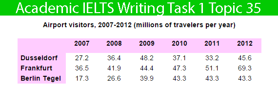
The table shows information about how many people
visited Germany through three major airports.
Over five years, there was a fluctuant trend in the
number of travellers who travelled via Dusseldorf, while the other two
airports saw an upward trend. Another interesting point is that Frankfurt
airport was the most popular in the end.
Looking at the details, the number of passengers at
Dusseldorf started at 27.2 million in 2007 and then increased remarkably
to reach the highest point of 48.2 million in 2009. In 2011, the
figure dipped to 33.2 million. In 2012, there was a slight growth to 45.6
million. On the other hand, Frankfort began at 36.5 million in 98; after
that, it rose remarkably for the next three years, to 47.3
million. In 2012, Frankfort hit the peak point at 69.3 million
passengers.
However, if we look at Berlin Tegel airport, it started
at the lowest point of 17.3 million travellers in the first year. After
this point, the trend increased significantly to 43.3 million
passengers.
Sample 8
You should spend about 20 minutes
on this task.
The table below gives
information on consumer spending on different items in five different countries
in 2002.
Summarise the information by
selecting and reporting the main features, and make comparisons where relevant.
» Write at least 150 words.
Percentage of national
consumer expenditure by category – 2002
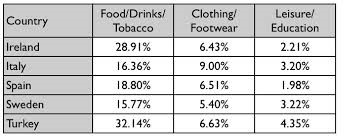
The table data represents the amount spent by consumers in Ireland, Italy, Spain,
Sweden and Turkey in three categories in the year 2002.
As is presented in the
table data, People
of those countries spent more on foods and tobaccos than they did for dresses,
education and entertainments.
According to the given data, Turk people spent the highest percentage of foods
and tobaccos amounting one-third of their total expenses on consumer products.
Irish people spent more than 28% on this category while people of Italy, Spain
and Sweden spent just over 15% for foods and tobaccos. For clothing and footwear,
the people of these five countries spent around 5% to 9% of which Italian spent
the highest percentage (9%).
Interestingly the expenditure in leisure activities and education was much
less than the amount spent on food, tobacco and dresses. The highest amount
spent on education and entertainment was done by Turkish people (4.35%) and the
least amount spent by was in Spain (1.98%). No nation among the given five
spent more than 5% in education and leisure activities according to the given
data.
Or,
The given table represents amount spent by consumers in five different
countries on different categories of items in the year 2002.
As is presented in chart people of Ireland, Italy, Spain, Sweden and finally
Turkey consumed specific amount on different items respectively as mentioned
different items like food and tobacco whereas clothing and footwear and finally
leisure and education.
Let’s analyse the data given table in detail. As is observed, Turkey consumed
excessive amount on food and tobacco which constitutes the highest percentage
of 32.14% whereas Ireland was the second top country which consumed significant
high amount on food and tobacco (28.9%) while Italy, Spain and Sweden spent
higher than 15% respectively.
On the other hand, all countries consumed fewer
amounts on clothing and footwear. As is observed, 9% was the highest amount
consumed on clothes & footwear by Italy consumers whereas Ireland, Spain,
Sweden and finally Turkey expenditures were less than 5%. Interestingly Turkey
gave priority to leisure and education and spent significantly higher (4.35%)
while at the same time Irish did not take interest in leisure and education and
spent only 2.21%.

No comments:
Post a Comment