
Define: Pie a type of graph
in which a circle is divided into sectors that each represent a proportion of
the whole. Moreover, it is a circular statistical
graphic, which is divided into slices to illustrate numerical proportion.
In order to secure high
band score, you should follow this structure:
- Introduction
- General overview
- Specific features
IELTS Academic Writing Task 1,
Pie Chart
Useful Tips for Pie Chart
1. Understand the
chart carefully: Note time (static/dynamic), categories,
units (%, million), and comparison.
2. Group similar
data:
Identify major and minor segments.
3. Use proportions
and comparisons: E.g., "twice as much," "equal
percentage."
4. Do not give
opinions or explanations: Just describe the data.
5. Paraphrase the
question in the introduction.
6. Avoid listing: Always compare
and group information logically.
7. Practice
paraphrasing and using variety in sentence structures.
Steps to Write a High-Scoring
Pie Chart Report
Step 1: Analyze the Question
- Read the
title, look at labels, units, years.
- Identify
what you are comparing.
Step 2: Write an Introduction (Paraphrase)
- Restate the
question in your own words.
Step 3: Write an Overview (General Trends)
- Mention highest,
lowest, equal, notable changes.
- No
figures—just general summary.
Step 4: Body Paragraphs (Specific Details)
- Group data
logically (e.g., highest to lowest, similarities).
- Use data (percentages)
to support your points.
- For dynamic
charts, mention how things change over time.
Structure of IELTS Pie Chart
Report
Paragraph 1: Introduction
→ Paraphrase the question.
Paragraph 2: Overview
→ Summarize the main features: highest,
lowest, equality, or significant trends.
Paragraph 3: Body 1
→ Describe and compare major segments with
figures.
Paragraph 4: Body 2
→ Describe and compare remaining segments
with figures.
Useful Vocabulary for Pie Charts
Introduction
- The pie
chart illustrates / shows / presents / compares...
- The chart
gives information about...
- The pie
chart provides data on...
Overview
- Overall, it
is clear that...
- It can be
seen that...
- A notable
feature is that...
- The most
significant trend is...
Describing proportions
- Accounted
for / Represented / Comprised / Made up
- e.g., Education
accounted for 30% of the total.
- The largest
proportion / segment / share
- The smallest
percentage / minority share
Comparing Data
- ...was twice
/ three times as much as...
- ...was similar
to / almost the same as...
- ...was higher
/ lower / more / less than...
- In
comparison with...
- ...whereas /
while / on the other hand...
Change over time (if applicable)
- Increased /
Rose / Grew
- Declined /
Dropped / Decreased / Fell
- Remained
stable / Unchanged
- Significant
/ Slight / Gradual / Steady
Example Overview Sentence
"Overall,
the majority of the expenditure was on food and housing, while entertainment
and transport made up the smallest shares."
Sample Linking Words
- Firstly /
Secondly / In contrast / On the contrary
- For example
/ For instance
- Moreover /
Furthermore
- As a result
- Compared to
/ Relative to
|
You should spend about 20
minutes on this task. The pie chart shows
the amount of money that a children's charity located in the USA spent and
received in one year, 2016. Summarize the
information by selecting and reporting the main features and make comparisons
where relevant. Write at least 150 words. |

The pie charts display the
amount of revenue and expenditures in 2016 for a children’s charity in the USA.
As can be
seen, donated food accounted for the majority of the income, while program
services made up the largest portion of the expenditure. The total revenue
slightly exceeded the total expenses.
To begin with,
86.6 per cent of revenue for this children's charity came from donated food in
a year, which is over eight times as much as contributions from the community
(10.4%). These two sources accounted for exactly 97 per cent of the total
income. Additionally, more than two percent income was provided by the program
revenue. Finally, the government grants and other income were almost
unnoticeable, less than 0.5 per cent.
At the same time,
the charity had to spend almost 96% on its program services. Regarding the
remaining 4.2 per cent of expenditures, 2.6% was for fundraising and the rest
was spent for management and general purposes. It is worth noticing that the
total amount of income was $53,561,580, which was just enough to cover the
expenditures of $53,224,896. At the end of the year, the charity had a saving
of just over 330 thousand dollars. (199 words)
Sample 2
|
You should spend about 20 minutes on this task. The pie charts compare ways of
accessing the news in Canada and Australia. Summarise the information by
selecting and reporting the main features, and make comparisons where
relevant. Write at least 150 words. |
The pie charts demonstrate the major ways of finding out the
news in two different countries, Canada and Australia. The two nations show
broadly similar patterns, though there are some differences, both significant
and minor.
Overall, it can be said that the high
levels of internet use in Australia mean that other methods such as radio and
print are used less in comparison with Canada.
To regards to online, 52 percent of
reports come from different online sources, whether in terms Canada it is 36,
and the second-most among the sources. Another big portion is the TV, 40 and 37
percent of news can be accessed through this medium in Canada, and Australia
respectively.
Now turning to the other three
features, in both countries least information can be attained from the radio,
while among those nations Australia has the value which is less than half of
Canada and that is 2 percent and it is equal to the no specified. From print
media, 14 percent of data can be achieved in Canada but in Australia, only 7
percent of information can people have.
Sample 3
|
You should spend
about 20 minutes on this task. The charts below show the
percentage of water used for different purposes in six areas of the world. Summarise the information by
selecting and reporting the main features, and make comparisons where
relevant. Write at least 150 words. |
Percentage
of water used for different purposes in six areas of the world.
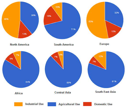
The provided illustration compares water
consumption for three main purposes in six different areas namely: North
America, South America, Europe, Africa, Central Asia and South East Asia.
Overall, it is clear from the charts that
Asian and African countries used more water for irrigation while North American
and European countries used more water for their industrial needs.
To begin with, a major portion of water
consumption could be observed in the agricultural sector and this was higher in
African and Asian regions than that of American and European parts. More than
80% of water in Africa and Asia went into agricultural fields while this
percentage was only 32% in Europe and 39% in North America.
North America and Europe required more water
in their industrial sectors than that of Asian and African countries. While
half of the water was used in the industrial sector in North America and
Europe, the percentage of that in African and Asian regions ranged from 5% to
12%. Interestingly, water consumption in North and South America shows a
contrasting scenario. Finally, more percentages of household water consumption
could be observed in American and European continents than that of Asian and
African regions. (199)
Sample 4
The pie charts give information about the world’s forest in five
different regions.
Summarize the information by
selecting and reporting the main features, and make comparisons where relevant.

The pie charts detail information about the world’s forests
and timber according to continent.
Looking from an overall perspective, it is readily apparent
that most of the world’s forests are in Africa and North America, followed by
Europe, South America, and lastly Asia. In contrast, Africa possesses the least
timber while North America has the most.
Looking first of all at North America and Africa, the former
continent represents 25% of the world’s forest and the latter 27%. In terms of
timber, the figure is slightly higher for North America (30%) and drastically
lower for Africa (9%).
Forest and timber ratios are more even in the other regions.
European nations contain 18% of the world’s forests and 20% of its timber.
South America is marginally lower at 16% for forests and moderately higher at
23% for timber. Finally, Asian forests constitute 14% of the global total and
18% of all timber.
(151 words)
Sample 5The pie chart shows women in poverty in the
United States and bar chart compares poverty rates by gender.
Summarize the information by selecting and reporting the main features, and make comparisons where relevant.

The pie chart gives statistics for the status of women in poverty and the bar chart breaks down poverty by gender and age demographics in 2008.
Looking
from an overall perspective, it is readily apparent that the majority of women
in poverty are single without children, followed by single with children, and
much more distantly by married women with or without offspring. In terms of
gender and age, younger people and women were more likely to be in poverty,
particularly female young adults and the elderly.
Looking first of all at the pie chart, an
overwhelming 54% of women in poverty were unmarried without children. This
figure was more than double that of single females with children (26%) and
considerably above married women with dependents (12%) and married women
lacking any children (8%).
In terms of the rate of poverty relating to gender and age,
more than 20% of those under the age of 5 were in poverty for both sexes.
Poverty rates then generally declined for men and women until the age of 45 –
54 to relative lows of 7% and 6%, respectively. The exception was that over 20%
of women aged 18 – 24 are in poverty, equal to the peak of the youngest
demographic. After the age of 54, poverty likelihood for men rose to 9% for
those aged 60-64 and then dropped to 5% for those over 75. For women, poverty
levels rose more steadily to reach 12% for the oldest age group.
The pie charts give information about the world’s forest in five
different regions.
Summarize the information by selecting and reporting the main
features, and make comparisons where relevant.

Looking
from an overall perspective, it is readily apparent that most of the world’s
forests are in Africa and North America, followed by Europe, South America, and
lastly Asia. In contrast, Africa possesses the least timber while North America
has the most.
Looking first of all at North America and
Africa, the former continent represents 25% of the world’s forest and the
latter 27%. In terms of timber, the figure is slightly higher for North America
(30%) and drastically lower for Africa (9%).
Forest and timber ratios are more even in the other regions.
European nations contain 18% of the world’s forests and 20% of its timber.
South America is marginally lower at 16% for forests and moderately higher at
23% for timber. Finally, Asian forests constitute 14% of the global total and
18% of all timber.
The table and pie chart illustrate populations in Australia according to different nationalities and areas. Summarize the information by selecting and reporting the main features and make comparisons where relevant.

The pie chart and table detail population figures in
Australia and if residents tended to live in rural or urban areas.
Looking from an overall perspective, it is readily apparent
that the vast majority of the population is Australian, followed by sizeable
numbers for other and British nationals, and more marginal figures for New
Zealanders, Chinese, and the Dutch. All demographics live overwhelmingly in
cities, especially individuals from China.
The pie chart indicates
that 73% of the Australian population is made up of Australians themselves.
This figure is followed distantly by other at 14%, residents from Great Britain
at 7%, New Zealanders at 3%, Chinese at 2%, and people from the Netherlands at
just 1%.
In terms of livings areas, Australians are
most likely to live outside cities, though 80% still live in urban
environments. Similarly, 83% of the Dutch live in cities and 17% in the
countryside. British and New Zealand residents display nearly identical
proportions with around 90% in cities. Finally, the Chinese live predominately
in the cities (99%).
The charts below show the
average percentages in typical meals of three types of nutrients, all of which
may be unhealthy if eaten too much.
Summarise the information by
selecting and reporting the main features,
and make comparisons where
relevant.

The graph shows how much sodium, saturated fat and added
sugars were consumed in the average meal in the United States.
Looking from an overall perspective, it is readily apparent
that the majority of sodium and fat were consumed at dinner, while most sugar was
eaten in snacks. Lunch also tended to be salty and have a lot of fat while
breakfast had the lowest percentages for all three nutrients.
Dinner and lunch had roughly similar, large proportions for
both sodium (43% for dinner and 29% for lunch) and saturated fat (37% for
dinner and 26% for lunch). The amount of sugar in an average meal for
dinner and lunch was much lower at 23% and 19%, respectively.
Turning to breakfast and snacks, which also had comparable percentages, they were both made up of 14% sodium. For saturated fats, snacks contained 21% and breakfast was slightly lower at 16%. In terms of sugar, there was the greatest disparity with 42% of snacks being sugary and just 16% of breakfasts being made up of sugar.
(174 words)

No comments:
Post a Comment