
A
detail information about it
Academic IELTS Writing Task 1 question requires
you to use several vocabularies to present the data given in a pie/ bar/ line/
mixed graph or to describe a process or a flow chart. Being able to use appropriate
vocabularies, presenting the main trend, comparing & contrasting data and
presenting the logical flow of the graph ensure a high band score in your
Academic IELTS writing task 1.
» Use
correct synonyms in your writing.
» Use a range of vocabulary.
» Do not repeat words and phrases from
the exam question unless there is no
alternative.
» Use some less common vocabulary.
» Do not use the same word more than
once/twice.
» Use precise and accurate words in a
sentence.
Your writing will be assessed in four different
categories as shown:
1.
Task Achievement (25%)
2.
Cohesion and coherence (25%)
3.
Lexical Resources (25%)
4. Grammatical range and accuracy (25%)
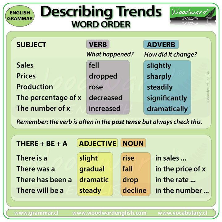
If a single graph, chart, table or figure
comes in question use singular verb (v5) or 's' in the verb like: shows,
illustrates, reveals, denotes, depicts, represents, demonstrates, delineates,
displays, presents.
You should always focus on three Wh-words
as they play important roles to develop our ideas and introduction as follow:
What: it
refers to the given information or data in the question
Where: it
show the place, region or country from where the information has extracted
When: it
means the date/time when it occurred
The provided information or data appears
in two different ways. They are as shown:
A. With time B. Without time
A. With time has been divided in two categories: Over the time and
fix time
1.
Over
the time: two
or more than two dates (time periods) will appear in the question ex. 1990, 2000 and 2010.
2.
Time
fixed: Only one (single)
time period will appear in the question ex. 2010.
B.
Without time: The
information or data will appear without any time duration. Therefore,
you can explain the data by using present tense.
In
IELTS writing task 1, there are four paragraphs important to create according
to the following structure,
Introduction - paraphrase the question
Overview - Most striking
features of the graph.
Main Body paragraph1 - Comparison /
Contrast about information
Main body paragraph 2 –
Comparison/contrast about information
Some important phrases to use for introducing the information to
paraphrase the question are as,
The given chart shows
that……
The provided graph
illustrates the………..
The supplied pie chart
delineates the…………
The presented line graph
demonstrates the………
The figure below reveals
the……..
The chart gives information……………
The supplied bar graph compares the …………
The bar graph and the table data depict the………..
Sample introductions of the question by
paraphrasing as mentioned,
1. The diagram shows employment rates among adults in four
European countries from 1925 to 1985.
2. The given pie charts represent the proportion of male and
female employees in 6 broad categories, dividing into manual and non-manual
occupations in Australia, between 2010 and 2015.
3. The chart gives information about consumer expenditures on
six products in four countries namely Germany, Italy, Britain and France.
4. The supplied bar graph compares the number of male and
female graduates in three developing countries while the table data presents
the overall literacy rate in these countries.
5. The bar graph and the table data depict the water
consumption in different sectors in five regions.
6. The bar graph enumerates the money spent on different
research projects while the column graph demonstrates the fund sources over a
decade, commencing from 1981.
7. The line graph delineates
the proportion of male and female employees in three different sectors in
Australia between 2010 and 2015.
How do you provide an
appropriate overview for the given information?
Your overview should hold the major
changes/ trends/differences of the data. You should not use any number,
percentage or data. Do not write more than two sentences in this paragraph.
Some of the useful phrases are as
listed below from where you can use one.
1.
In
general……...
2. In common……....
3. Generally speaking...........
4. Overall………....
5. It is obvious..........
6. As it is observed…….
7. As a general trend...........
8. As can be seen..............
9. As an overall trend/ As overall trend...
10. As it is presented.............
11. It can be clearly seen that.............
12. At the first glance...........
13. It is clear,…….
14. At the onset............
15. It is clear that…....
16. A glance at the graph(s) reveals that………...
Sample answer for overview:
1. In general, the employment
opportunities increased till 1970 and then declined throughout the next decade.
2. As it is observed, the figures
for imprisonment in the five mentioned countries show no overall pattern,
rather shows the considerable fluctuations from country to country.
3. Generally speaking, citizens in
the USA had a far better life standard than that of the remaining
countries.
4. As can be seen, the highest
number of passengers used the London Underground station at 8:00 in the morning
and at 6:00 in the evening.
4. Generally speaking, more men
were engaged in managerial positions in 1987 than that of women in New York
this year.
5. As an overall trend, the number
of crimes reported increased fairly rapidly until the mid-seventies, remained
constant for five years and finally, dropped to 20 cases a week after 1982.
6. At a first glance, it is clear
that more percentages of native university pupils violated regulations and
rules than the foreign students did during this period.
7. At the onset, it is clear that
drinking in public and drink-driving were the most common reasons for US
citizens to be arrested in 2014.
8. Overall, the leisure hours
enjoyed by males, regardless of their employment status, was much higher than
that of women.
Some useful phrases to start Main Body
paragraphs
As it is presented in the
diagram(s)/ graph(s)/ pie chart(s)/ table…....
As (it is) shown in the illustration……….
As can be seen in the……....
As the diagrams suggest……..
According to the..........
Categorically speaking……...
Getting back to the details……..
Now, turning to the details……..
The table data clearly shows that……...
The diagram reveals that……..
The data suggest that……..
The graph gives the figure….....
It is interesting to note that…….
It is apparently seen that………
It is conspicuous that……...
It is explicitly observed that……...
It is obvious……..
It is clear from the data……..
It is worth noticing that……....
It is crystal clear/ lucid that……..
It can be clearly observed that……...
It could be plainly viewed that……..
It could be noticed that.........
We can see that……..
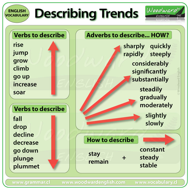
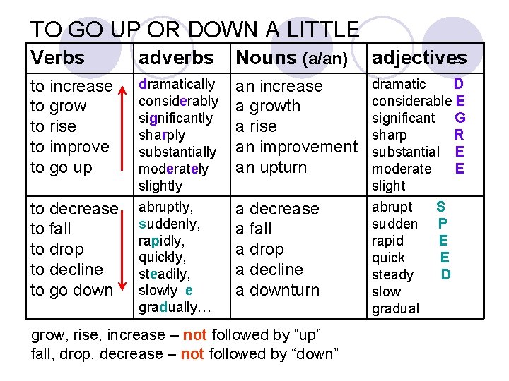
Types of Changes/
Differences and Vocabulary to present them:
Great change / huge difference:
Adjectives
Adverbs
Overwhelming
Overwhelmingly
Substantial
Substantially
Enormous
Enormously
Big change / Big difference:
Adjectives
Adverbs
Significant
Significantly
Considerable
Considerably
Medium change / Moderate difference:
Adjectives
Adverbs
Somewhat
Somewhat
Moderate
Moderately
Minor
change / Small difference:
Adjectives
Adverbs
Fractional
Fractionally
Marginal
Marginally
Slight
Slightly


How do you
show percentages, fractions and proportions?
Here are
some examples mentioned so that you can feel easy to understand.
Percentages:
10%
increase, 25 percent decrease, increased by 15%, dropped by 10 per cent, fall
at 50%, reached to 75%, tripled, doubled, one-fourth, three-quarters, half,
double fold, treble, 5 times higher, 3 timers lower, declined to about 49%,
stood exactly at 43%.
Fractions:
4% = a tiny fraction.
24% = almost a quarter.
25% exactly a quarter.
26% = roughly one quarter.
32% nearly one-third, nearly a third.
49% = around a half, just under a half.
50% exactly a half.
51% = just over a half.
73% = nearly three quarters.
77% = approximately three quarter, more than three-quarter.
79% = well over three quarters
What
do you mean by fraction?
A fraction simply tells us how many
parts of a whole we have.
Proportions:
2% = a tiny portion, a very small proportion.
4% = an insignificant minority, an insignificant proportion.
16% = a small minority, a small portion.
70% = a large proportion.
72% = a significant majority, A significant proportion.89% = A very large proportion.
89% = a very large proportion
Note: Fraction,
proportion and percentage refers to the parts of a whole.
Words/ Phrases for
showing Approximation - Vocabulary:
Approximately
Nearly
Roughly
Almost
About
Around
More or less
Just over
Just under
Just around
Just about
Just below
A little more
than
A little less
than.

No comments:
Post a Comment